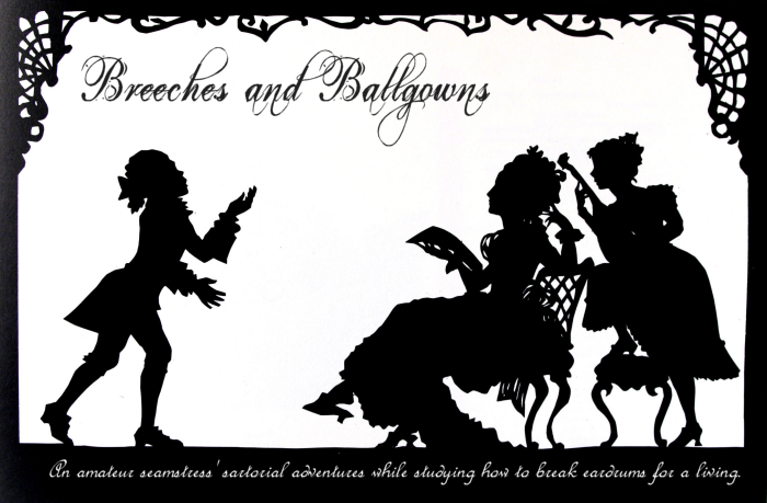
For personal enjoyment more than anything else (which seems to have been the point of the rest of this blog thus far, though I don't really mind), I've tinkered with the HTML and a few images used in this blog and designed a spiffy new layout. I think the new version is a bit easier on the eyes, meaning it doesn't have the back-to-back red and orange tones that could appear eye-gougingly saturated on some monitors.
The new theme is simpler yet more elegant, I think, and the subject of it has a certain resonance with me.
Bonus geek creds to anyone who recognizes the scene depicted in my new header.
Aside from the obvious cosmetic changes (background, header image), I did some tinkering under the hood and changed the column sizes so more text will fit in a page. The expanses of background space previously left untouched by words was driving me mad.
I might do a bit more tweaking over the next few days, but I'm very happy with how my renovation has turned out thus far. I can't stop staring at the gorgeous silhouette image I found for the header and the lovely black/white/burgundy color combination; I hope my further costumial endeavors can live up to the elegance the new design advertises.
I just put in an order for eight historical patterns at $0.99 each online, so a chance to test my skills should be arriving in the mail within a few weeks. In the meantime, there's plenty of other things to do.
Fantasie Suite
2 years ago


Cool blog...I have a feeling you would enjoy mine too...
ReplyDeleteJulie
www.ridingaside.blogspot.com